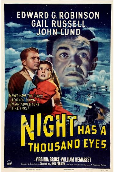
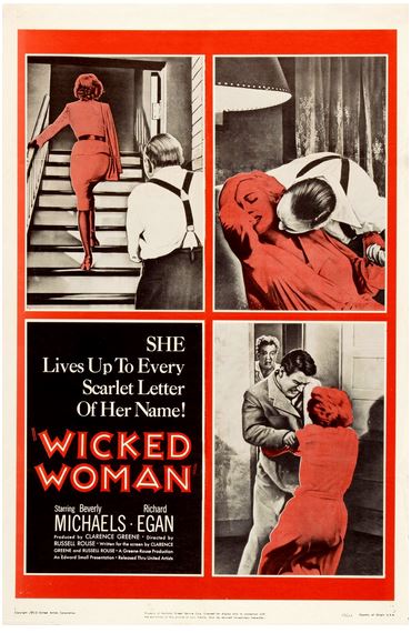
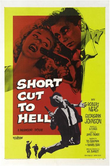
Quelques affiches

 Quelques affiches
 par Borges Dim 13 Jan 2013 - 18:17
careful a écrit:Quelques affiches peintes.
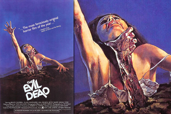
"THE EVIL DEAD (1981) - de Sam Raimi.
Children's movies, specifically Disney movies, use a lot of blue (and purple) * in the backgrounds of their posters and films. Horror movies, on the other hand...not so much.
Which is one of the reasons this design is unsettling. The other is the dutch camera angle. If this was a straight on image it would look more like a hair metal band album, but because of that slight tilt, it looks like its trying to make you sick when you look at it, which fits perfectly along with director Sam Raimi's camera work."
* 17 min de redimensionnement et de recherche pour si peu. Entreprise veine, peut être, mais je surmonte cela les doigts dans le nez:
Peter Pan
La Belle et la Bête
Marry Poppins
Cendrillon
Bernard et Bianca
Blanche Neige
La Belle et bois dormant
Taram et le chaudron magique
Merlin l'enchanteur
Pocahontas
La Petite Sirène
Les Aristochats
Fantasia
Rebelle
Pinocchio
Toy Story
Oliver et compagnie
La Princesse et la Grenouille
Aladdin
Kuzco
Le Roi Lio 2
Nemo
Hercules
Ratatouille
101 Dalmatiens 2
Petit bonus soudain et cristallin
Etc.
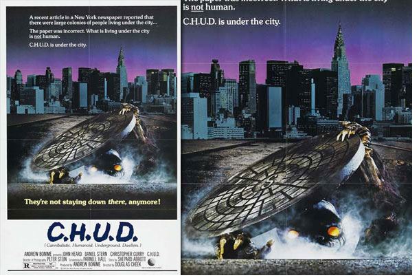
"C.H.U.D. (1984) -de Douglas Cheek.
Everyone from the Simpsons to Ol' Dirty Bastard has made C.H.U.D. references and I am completely convinced that it's based solely off of this image rather than the movie itself. The image is a perfect example of how to present a glimpse into the world that you are about to watch. According to this design, this movie seems to be about some cannibalistic mutants living in the sewers of New York. Guess what the movie is actually about? Cannibalistic mutants that live in the sewers of New York. Great.
Note: This design was hand composited from numerous graphics and hand painted on top of it. It's not fully painted, but it's fully awesome."
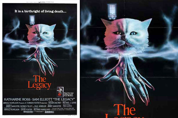
"THE LEGACY (1978) -Psychose phase 3- de Richard Marquand.
I wanted to get this one out of the way because this is the only movie on this list that I haven't seen. But that's never stopped me from loving the hell out of this poster. When combining all of the elements of its design, including the art, the name, the tagline, and even the tiny version of the poster in the corner, it's still near impossible to tell what this movie could even be about, unless it genuinely IS about the Thing from the Addams Family dressing up for Halloween while being voiced by the guy from The Who."
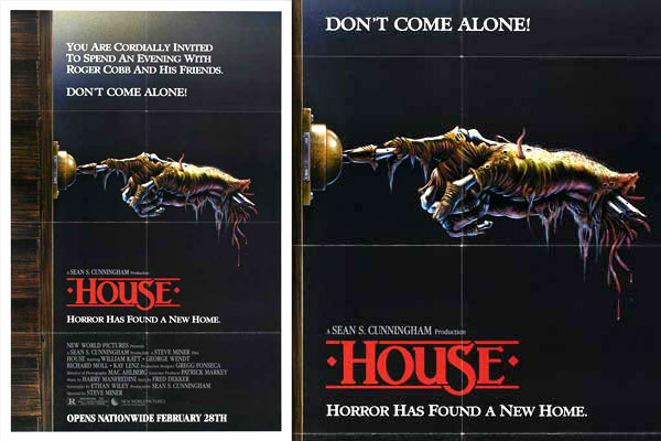
"HOUSE (1986) -de Steve Miner.
This design is a perfect example of taking a minimal design and executing it in maximum fashion. The style of the painting, reminiscent of a Bernie Wrightson drawing come-to-life, simultaneously mixes a gross, decaying, rotting subject matter and gives it a light, whimsy heart. Which is exactly what the film does."
"ARMY OF DARKNESS (1992) -L'armée des ténèbres- de Sam Raimi.
For National Lampoon's "Vacation", Boris Vallejo designed a parody homage to a Frank Frazetta style fantasy painting. Vallejo's goal was to create something epic out of something goofy. That poster became an icon of its own. 10 years later, for Sam Raimi's Evil Dead sequel "Army Of Darkness", artist Michael Hussar designed a parody homage to that "Vacation" poster. In a similar move, it's goal was to take something epic and horrifying, and make it goofy. The results are beautiful.
You can see Hussar's original full painting here."
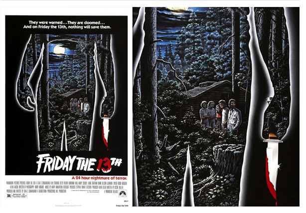
"FRIDAY THE 13TH (1980) -Vendredi 13- de Sean S. Cunningham.
There is an old Marvel comics character named Eternity who basically is the embodiment of everything in the universe. This iconic poster has always reminded me of Eternity, only in this poster, the entire universe consists of 4 campers cluelessly hanging out in his intestines."
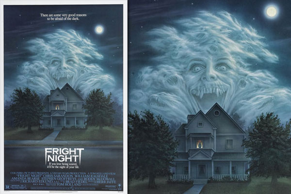
"FRIGHT NIGHT (1985) -Vampire, vous avez dit vampire?- de Tom Holland.
When was the last time a cast member from Married With Children got the main iconic treatment on a major movie poster like Amanda Bearse ? What a face she has here.
Like the "House" poster, this is a great example of a simple, subtle design done in such an over the top manner with such attention to detail (see all of the demon faces around the clouds and Jerry Dandrige in the window?) that it's mindblowing to think that a movie studio nowadays wouldn't want to use this.
ps: Jerzy,j'ai vu, sous tes conseils, le Fright Night avec Colin Farrell...et "Mc Lovin" !
La photo m'a marqué, cette longue nuit américaine. Un bon drive-in movie. "Frais" comme tu dis
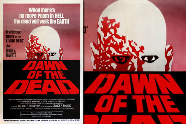
"DAWN OF THE DEAD (1978) Zombie - Le crépuscule des morts-vivants- de George A. Romero.
This design is simple. And this design is striking. A blank expression is simply a blank expression until you add the word "dead" to its context."
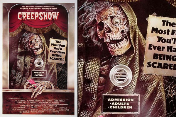
"CREEPSHOW (1982) -George A. Romero.
An homage to EC Comics series like "Tales from the Crypt" and "Vault Of Horror", it makes sense that George Romero and Stephen King employed horror illustrators like Jack Kamen and Bernie Wrightson for some of the "Creepshow" marketing. However, I 've never been able to pinpoint who exactly designed and painted this poster. But that won't stop me from loving it, and from silently hoping that every time I go see a horror movie in the theater that this creep will be selling me my ticket."
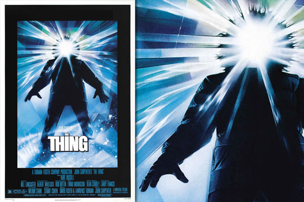
"THE THING (1982) - de John Carpenter.
Out of the hundreds of posters that Drew Struzan (le gars derrière les affiches des Star Wars, les Goonies, Blade Runner, Retour vers le futur,Indiana Jones, Miracle sur la 8ème rue, Fiével et le nouveau monde, Harry Potter, etc) created as I had mentioned with Squirm , to me "The Thing" is his masterpiece.
Although it's beaming with light and wearing a parka, the faceless being depicted here is terrifying no matter the context. If you saw this silhouette in a field of gardenias it would still look like a monster. And it's cold in this design. In fact it feels freezing, thanks to Struzan's perfectly straight hard lines and perfect glares."
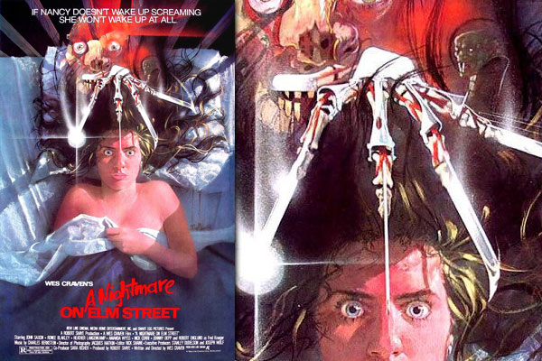
"NIGHTMARE on elm street(1984) -Freddy- de Wes Craven.
This poster is the main reason why Photoshop needs to throw in the towel and remove itself from this industry.
This design fits every aspect of important marketing tactics (collage of imagery, iconic shape, bold background, subtle narrative and simple layout) yet it does so while being created in an original style that can only be translated through non cut/paste/stock/photoshop art. Check out the original full painting here.
There is literally a nightmarish quality to the weird art style that designer Matthew Peak injected into this design that just couldn't be created using photographs blended together in Photoshop. Luckily for us, Matthew Peak was able to design a majority of the Nightmare series' posters until Photoshop beat him up and took his job for Freddy Vs Jason.
Nightmare
Nightmare 2
Nightmare 3
Nightmare 4
Nightmare 5
All in all, I'm not bashing Photoshop or Illustrator as design tools, as I think they are incredible and have opened creative doors for millions of people, myself. But I do think that Photoshop, and other programs like it, give some corporations and industries easy reasons to default to something that it is quick, easy to mimmic and cheap. And all it takes is a few extra minutes to think about how to utilize Photoshop to make something original and iconic."
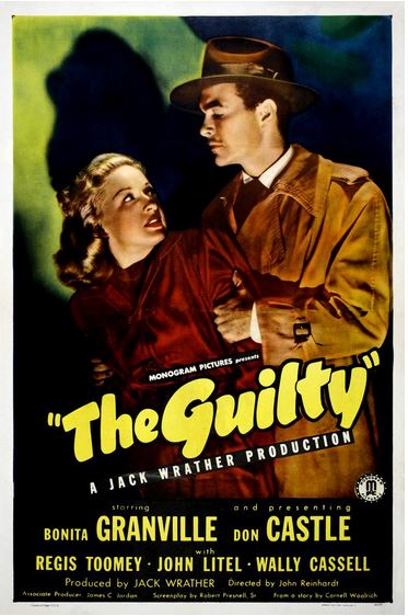
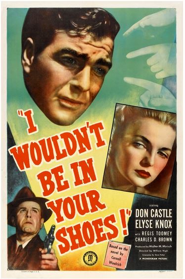
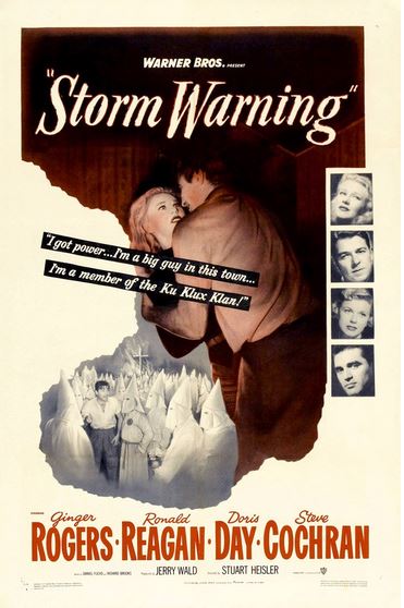
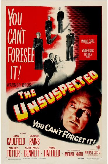
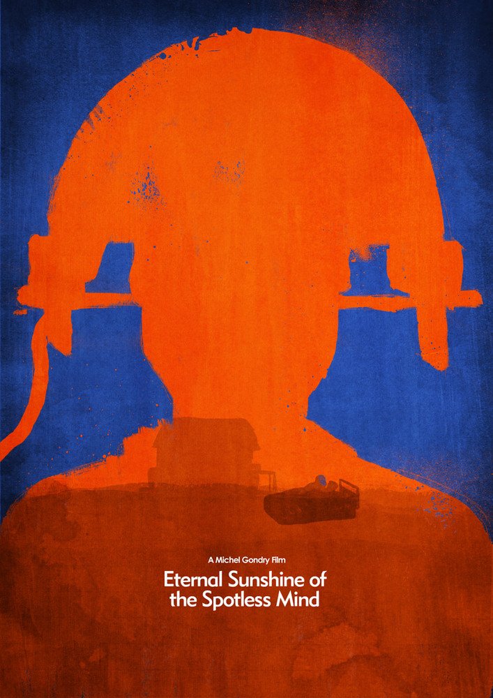
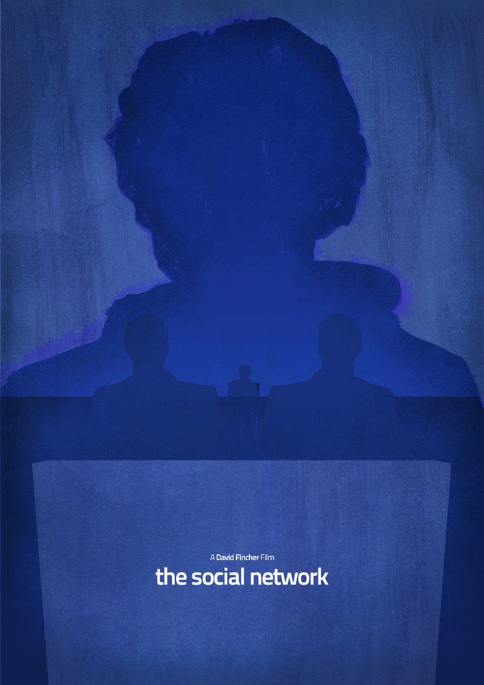
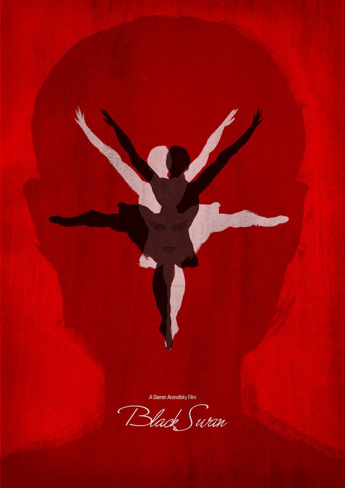
Et puis, une partie d'une série que je collectionne:
Sinon il y a deux ou trois peintures réalisées par un certain Dean Walton, malgré le fait que son procédé s'épuise très rapidement.
Le reste en spoiler:
- Spoiler:
C'est deux là également dont je ne connais l'auteur.
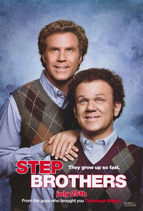
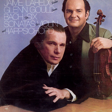
Celle de Step Brothers (Frangins malgré eux - d' Adam McKay - 2008) me fait irrémédiablement penser à l'album de Glenn Gould et Jaime Laredo.
Je posterais bien toute une série d'affiches de films d'horreur des années 50 que j'affectionne mais je vais attendre un peu, pour le bonheur des temps de chargement d'une page sous PHPBB.


Borges- Messages : 6044

» Affichons les affiches
» D'image le monde (de quelques stars médiatiques planétaires, et de leur reflet)
» quelques notes sur le cinéma de J Stahl
» Peter Watkins (quelques problèmes ?)
» quelques trucs lus sur la liste noire
» D'image le monde (de quelques stars médiatiques planétaires, et de leur reflet)
» quelques notes sur le cinéma de J Stahl
» Peter Watkins (quelques problèmes ?)
» quelques trucs lus sur la liste noire
Permission de ce forum:
Vous ne pouvez pas répondre aux sujets dans ce forum|
|
|